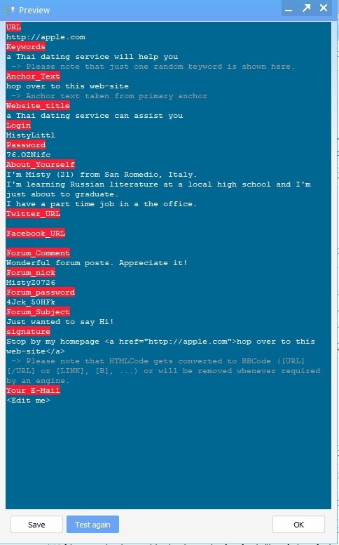
Test Window colors
 rastarr
Thailand
Hi,
This is only about a color change to the test window in GSA SER
As I'm only a new user as well as being a 64 year old, I find the colors used to be rather jarring and difficult to read.
Is it possible to consider a more toned down and muted color scheme such as like using pastel blue and red with black type? White type is not the easiest to read

Tagged:
Comments